BERNADETTE OFICIAL
Branding

About the Project
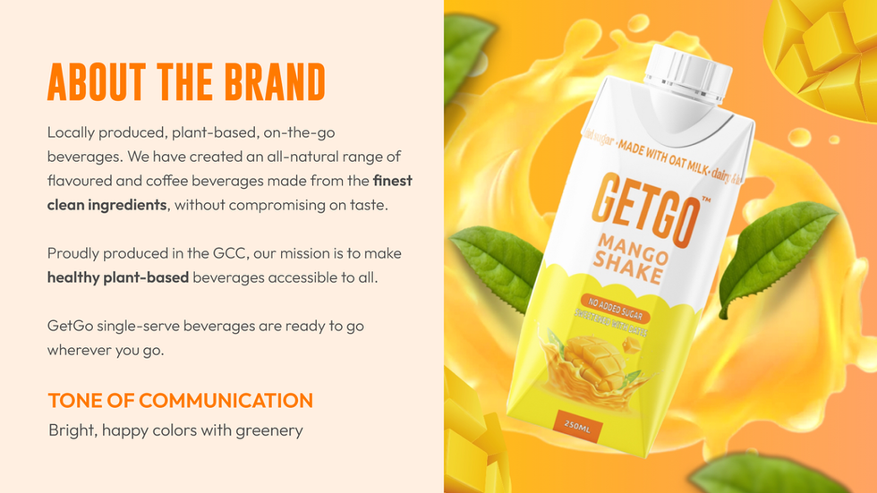
For GetGo, the concept revolved around a plant-based beverage that my client wanted to pitch to potential investors and customers. My role was to shape the brand identity in a way that would immediately convey freshness, energy, and a natural lifestyle. I also had to create the packaging for this and the brand took many iterations as the client keeps changing the brand name. You can find more information about this in the packaging section. I created a motion graphic for this brand as well using After Effects, since I have limited time, I worked on it in a rush. Overall, the client was satisfied as it was all delivered before the deadline so they can present it.
I selected orange as the primary brand color because of its strong association with vitality, energy, and refreshment—qualities that perfectly align with a juice drink. Orange naturally evokes the feeling of citrus and fruit, making it both appetizing and energizing. To balance this, I incorporated yellow and green as secondary tones. Yellow reinforces brightness, positivity, and warmth—an inviting element for a consumer-facing product. Green, on the other hand, ties directly to the “plant-based” aspect of the brand, symbolizing health, nature, and sustainability. Together, these colors created a vibrant and fresh palette that is both eye-catching and aligned with the values of wellness and natural living.
In developing the overall look, I also ensured that the typography, logo variations, and packaging mockups leaned into a bright and modern aesthetic. This allowed the product to stand out on shelves while still communicating its natural, plant-based origins. The result was a branding guideline that helped my client position Getgo as a fun, fresh, and health-conscious option in the competitive beverage market.


